Mappa ruined Attack on Titan with a grotesque Final Season
Attack on Titan, known as Shingeki no Kyojin in Japan, was a show that had as much intrigue in it's art and animation as it had in it's music and the actual story itself.
It was an absolute joy to experience.
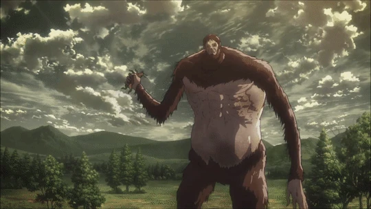
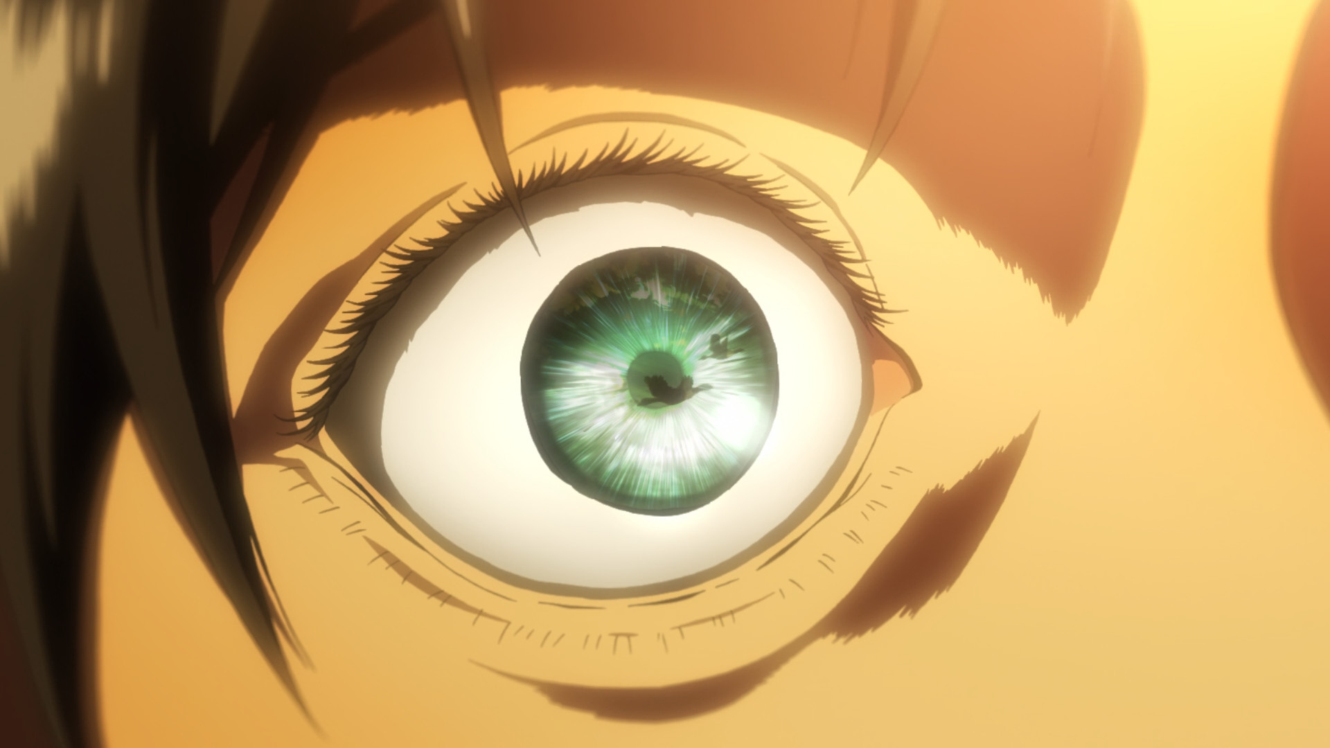
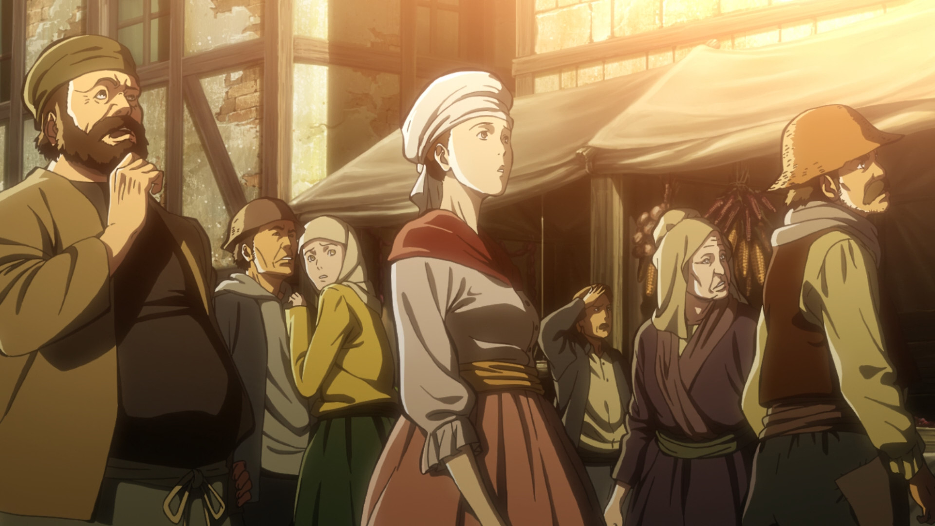
The world felt alive and the Titans were human-like and felt like they are made of actual flesh and blood. They had a very intimidating and eerie presence to them. They felt like they actually belonged in the same world as the characters.
The camera angles and directing didn't need to hold back at all since 2D would look good regardless, and could even take advantage of unique camera angles.
The difference between good CGI and bad CGI is that good CGI actually adds to the quality. Bad CGI is when 2D would look better than its CGI equivalent, which is most of the time.
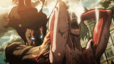
The Final Season's jarring and ugly CGI is an eyesore and even Mappa and the director know it. Many attempts are made to hide it with very bad camera angles and quick cuts that ruin any potential for good direction and throws Attack on Titan's previously established standards right out of the window.


They look like cheap plastic action figures.
Even scenes that received the most attention by the CGI director look ugly, bland and boring.

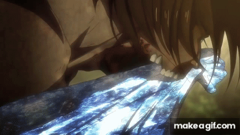
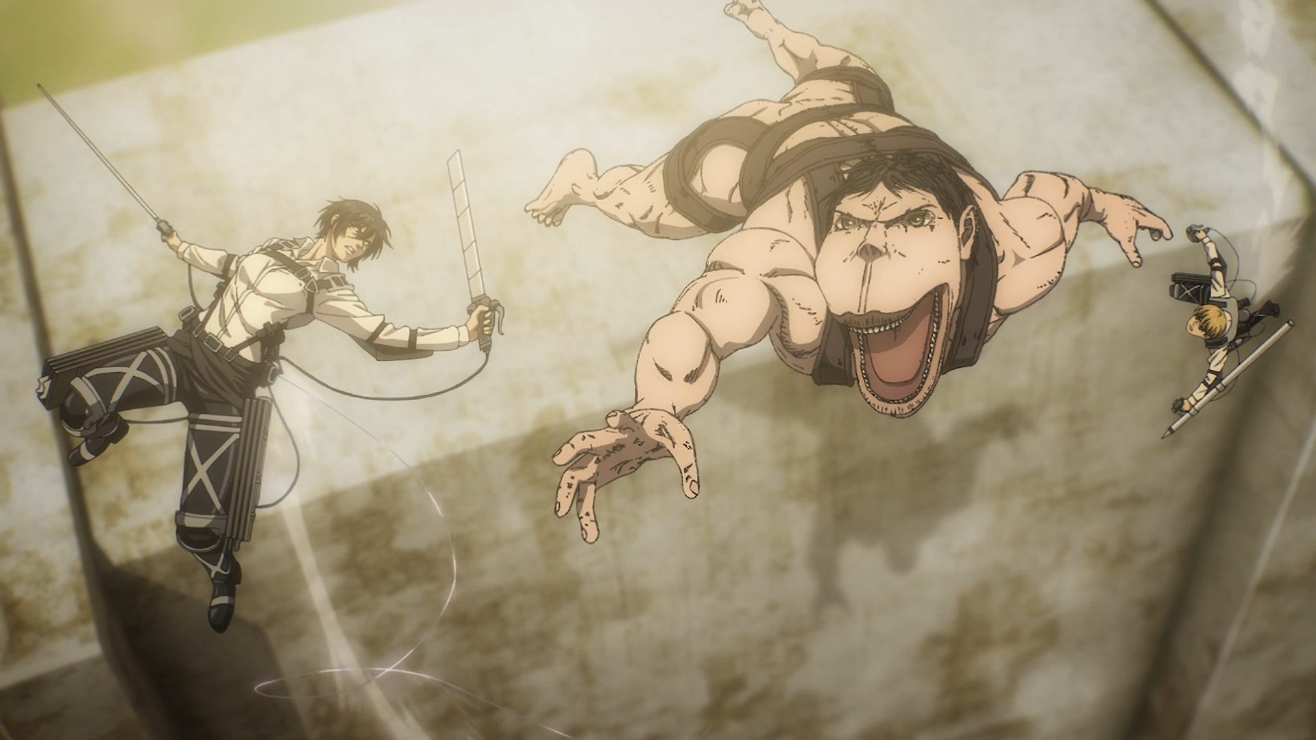
This is the best that Mappa and it's directors could do. The same punch over and over with a terrible camera angle in one of the most anticipated fights in the series. Boring and repetitive. There is ZERO feeling of impact whatsoever and no usage of martial arts, which this show was known for using in its fight scenes.
There is no comparison with the previous seasons. WIT used actual martial arts in many of their scenes, and the impact from punches could be felt as if they actually happened.
Powerful moments were filled a staggering amount of detail in the art, animation and the directing. But then the powerful moments were replaced with something that looks like moving cardboard.
Look at how bad it became. It's actually shocking how low the quality of the show fell.
Mappa lied straight to our faces with the initial trailer of the Final Season that featured 2D animated Titans.
Yeah right. Hilarious. The actual scene doesn't look anything like this.
The actual scene is full of close camera angles and bad cuts to hide the jarring and ugly CGI.
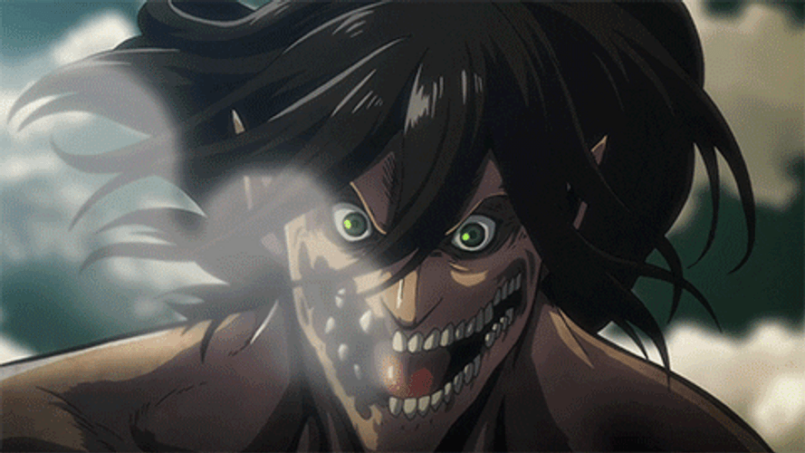
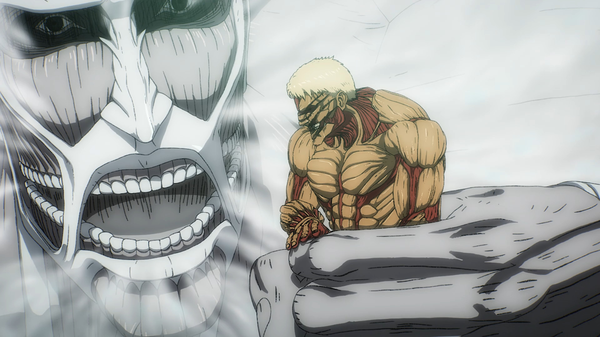
Even the characters themselves which were well designed and had believable and striking facial expressions weren't spared.
Even they took massive hit in quality and design.
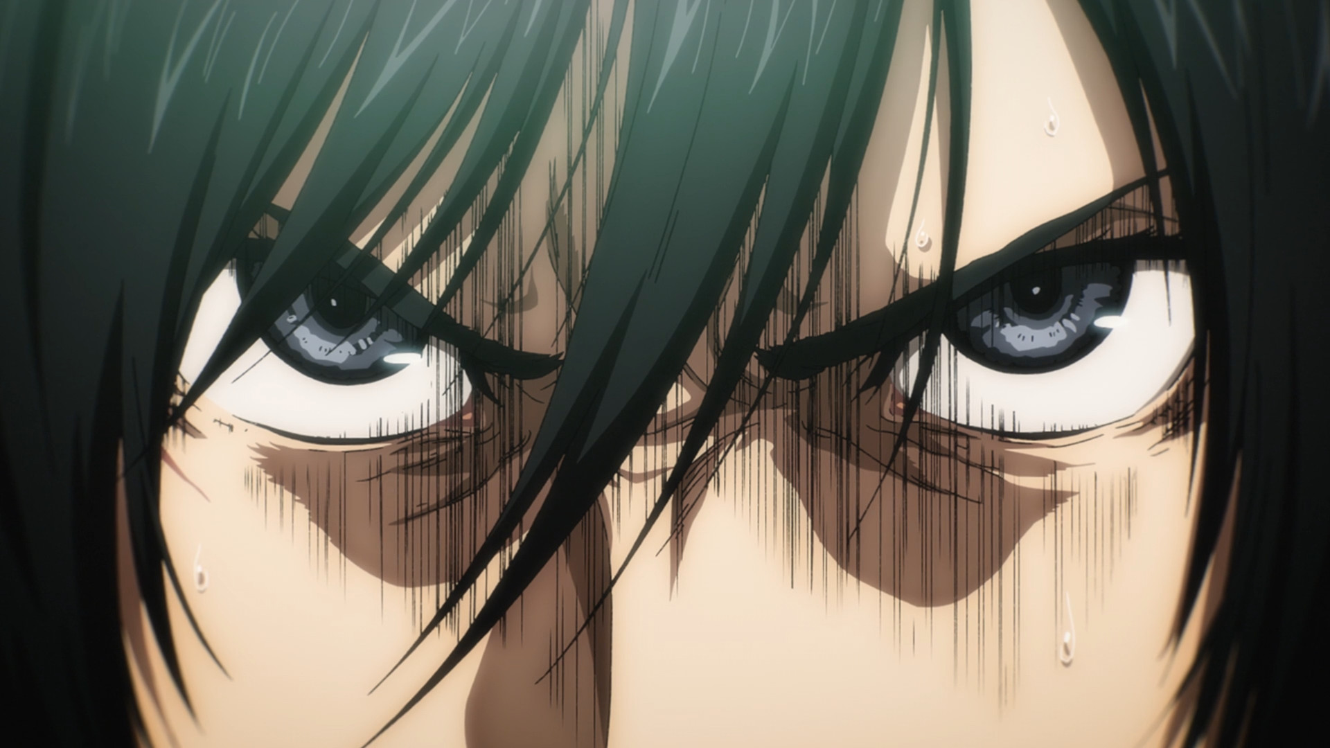
Perfection. This was an actual animated shot from season 1 episode 4.
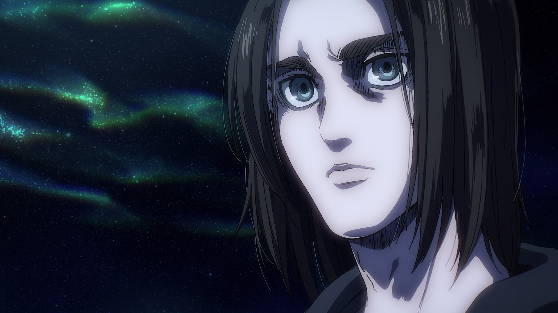
Now compare it to a literal still from Mappa.
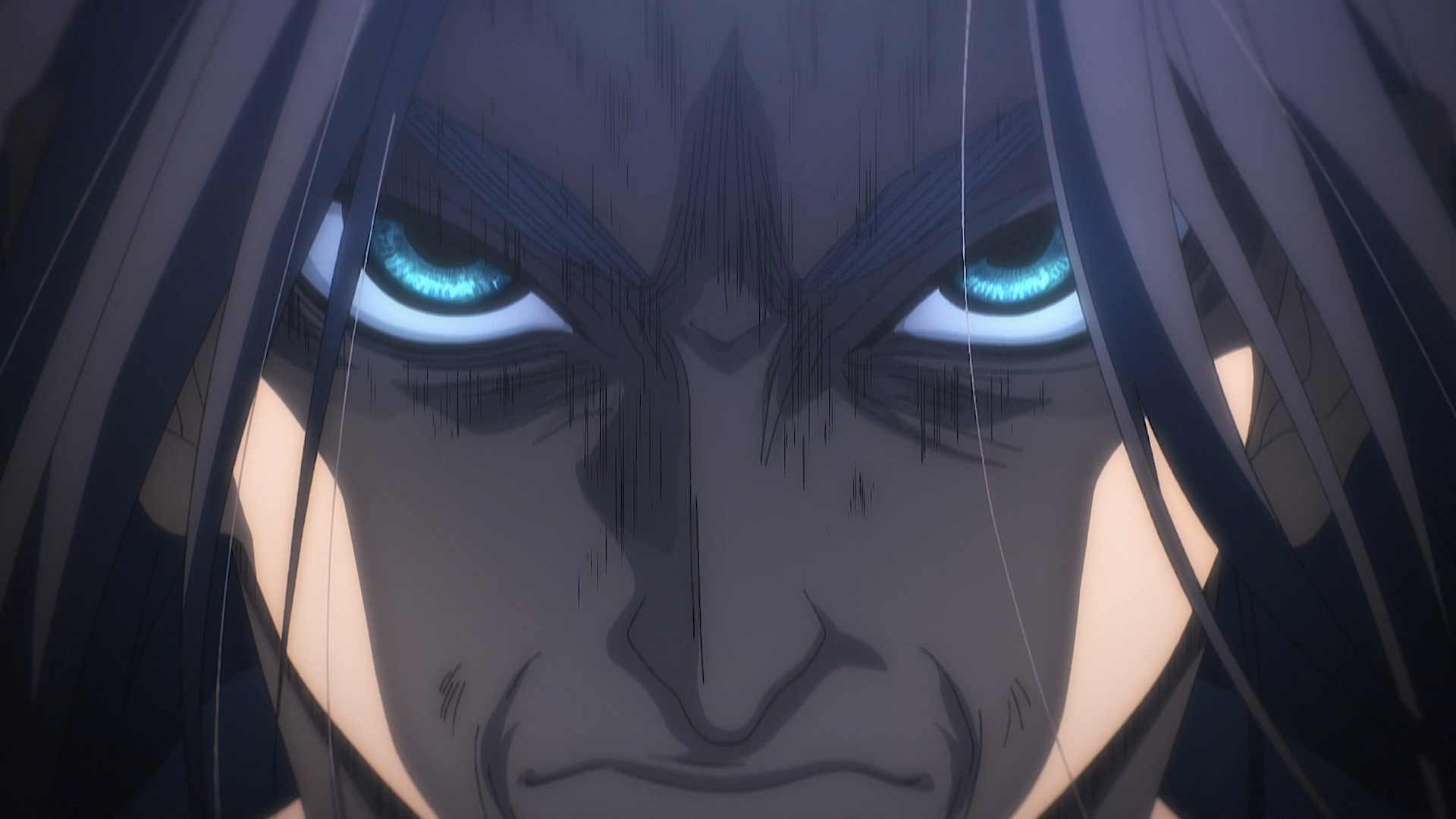
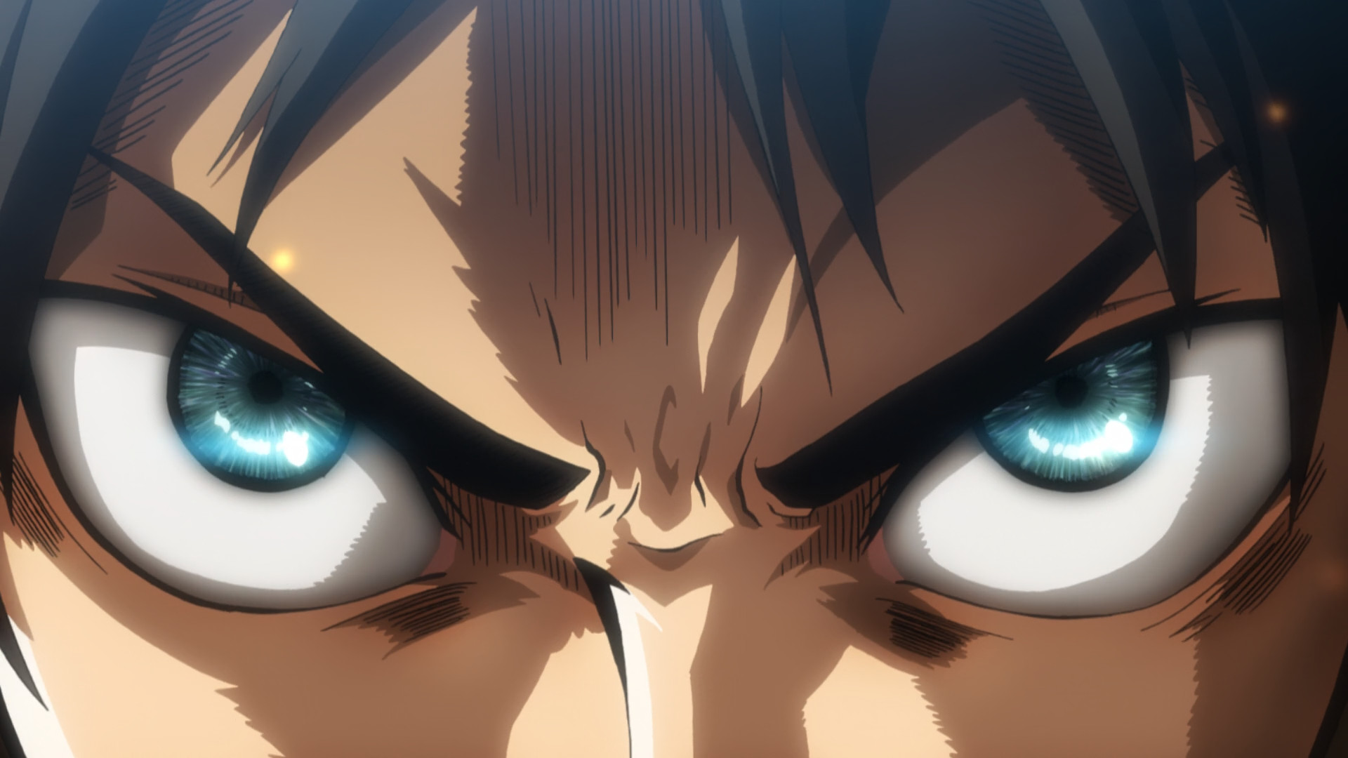
Who is this? Is it Eren or some angry woman?
This one is literally from the FINAL episode of the show. And it's still not even comparable.
Who are these characters? They don't look anything like the previous seasons. Why would the art style change so drastically that even the characters themselves are unrecognizable?
This does not look like Eren to me.
How do fans let stuff like this slide?

Chicken scratch around the eyes, a bad color palette and even the characters faces don't match up to their already ugly designs most of the time.
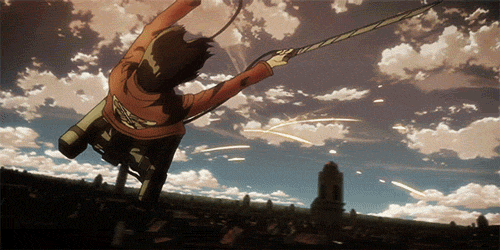
Even the ODM scenes received a massive drop in quality. Smooth and gripping animation was replaced with a choppy and awkward mess.
Again. No comparison to S1-S3's animation.

You can feel the love and attention that WIT studio put into that.
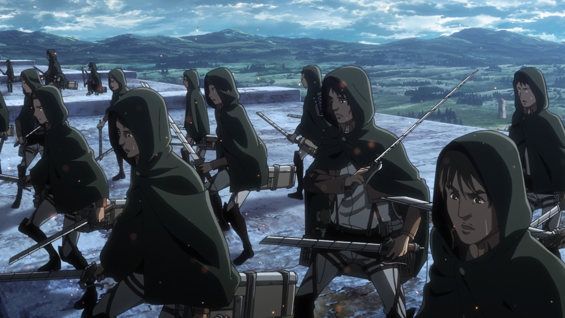
These next ones are shots from THE FINAL EPISODE of a show that had MILLIONS of extremely loyal fans.
Atrocious. I can't believe what they put out there.

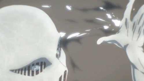
The ancient Titans were also supposed to be colored, and not white!
We all remember Bertolt the White Colossal Titan right?
Is this what we want from our anime? Regressions so big that ruin everything that was previously established as the standard in the show?
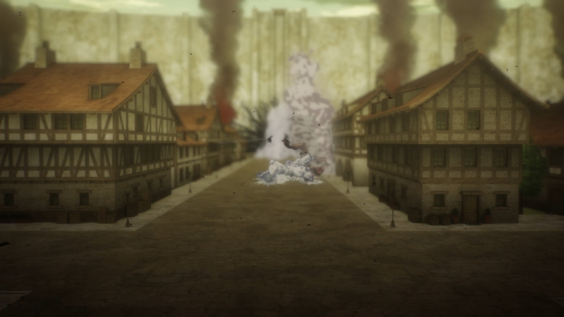
Why does it look so bland? It looks like it's not even close to finished yet!
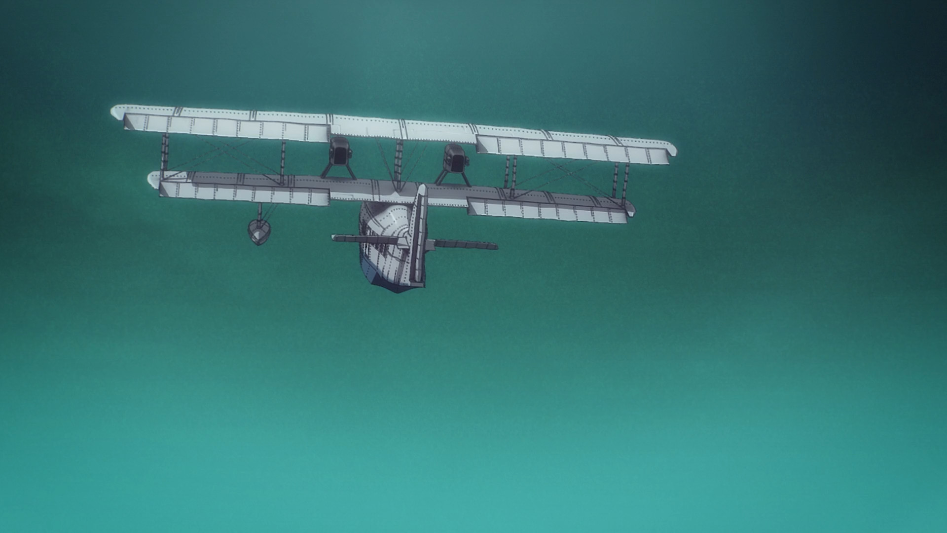
Why is the sky so empty and boring? Why is the plane so lacking in detail and shading?
Now compared to shots by WIT studio from Season 3 Part 2.
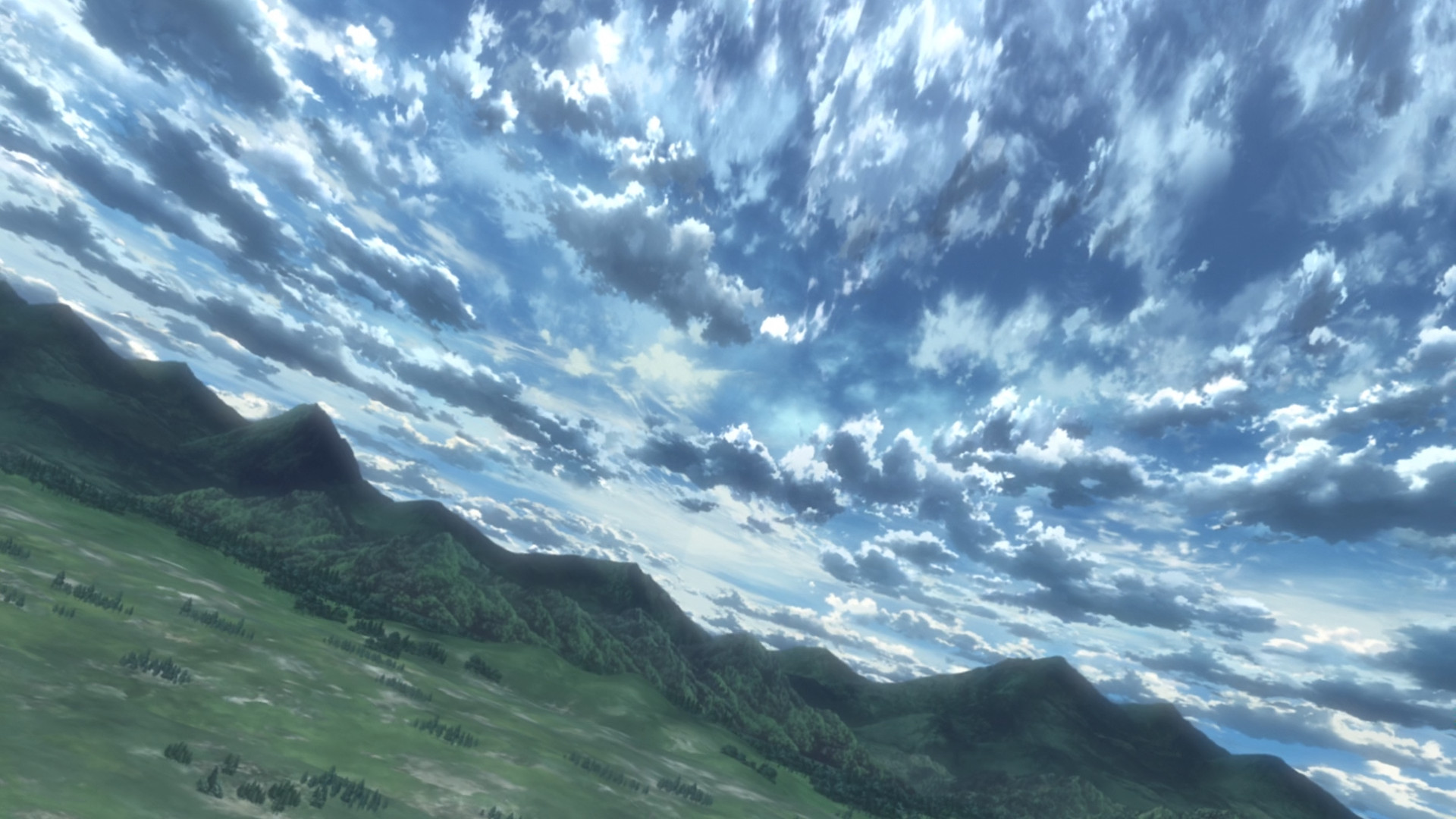
WIT studio had less time to create these episodes. It was a schedule worse than any schedule Mappa ever had to deal with. WIT had less time and created a vastly superior product. Goes to show you how lazy Mappa is.
Looking back on the first episode, I remember not believing my eyes because of what I was seeing. It all looked and felt amazing.

How could someone bring themselves to replace that, with this?

It looks like PS2 era graphics on low settings, and I'm being generous here. I can't believe that this is the same AoT that I loved.
Here's a random WIT Studio Historia gif to wash out the bad taste.

Attack on Titan used to be beautiful, until it got ruined by greed and lack of love for the artform.
Mappa ruined AoT with their greed, laziness and with their absolute lack of love and passion for the artform.